Already, it’s the third week in July- wow, it’s flying! Linking up with Robyn’s wonderful blog, Captivate Me, for this challenge. So much to see there! Check it out! I learn so much from these folks! Well, here’s my edit for this week and an extra for the fun of it.

This week I set out to enhance the colors in the photo. I began with the original photo and went straight to the Selective Color Sliders in PS3. First I went to the greens and pushed what little green there is to really stand out. Next, I made the golds golder and the blues bluer. And ever so slightly, I made the neutrals deeper. I got brave and painted some shadows into the waves.
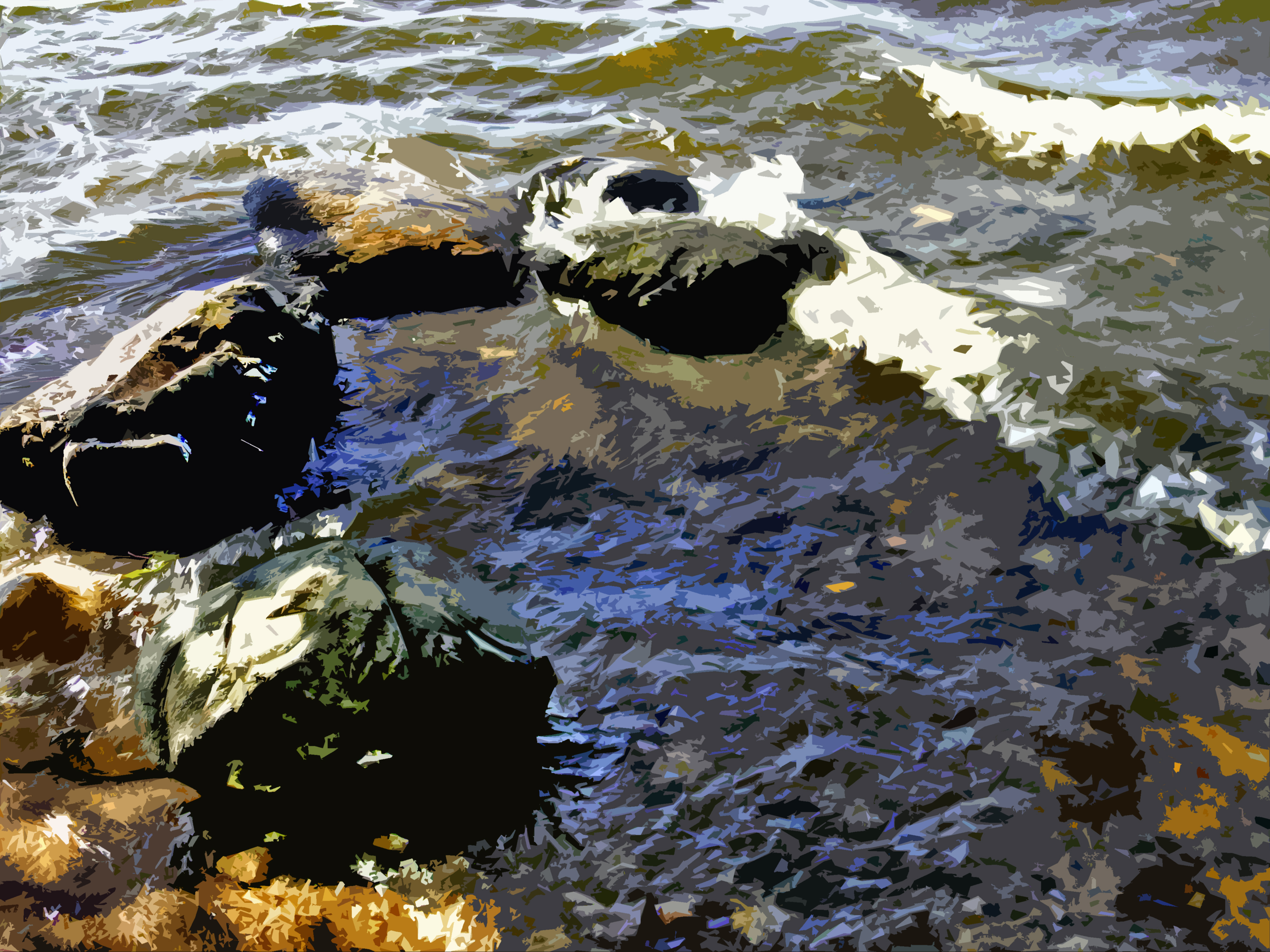
Then I couldn’t help myself and I threw it back into PS to see what it would look like with the Cutout filter:
Lot’s of fun! Thanks for joining me!

love that! inspires me to go back to Photoshop and play 🙂
LikeLiked by 1 person
I was thinking that you should o that with your new photos!
LikeLiked by 1 person
my favorite thing on it is the cutout filter, I used to sit for hours. had to make myself stop!
LikeLike
cool..I will have to play more with PS
LikeLiked by 1 person
I know that I could clone some of those waves but I can’t figure out how to! Still, I learn more every day.
LikeLike
Love the depth of the blues!
LikeLike
Me too! I’m dyeing fabric now for the fabric collage I’m planning for this pic!
LikeLike
Excellent!
LikeLike
I love the rich colours of the first edit but the 2nd edit, with the cutout filter, really appeals to me. 🙂 Good job.
LikeLiked by 1 person
Thanks!
LikeLike
I really like them both! The cut out filter gives some fabulous results doesn’t it – I think it really appeals to U.S. Textile Artists too 😃
Love that you’ve pushed the colour and added some shadows. I find this contrasty colour version very appealing. Nice Janis!
LikeLike
That was ‘us’ – not U.S. 😜
LikeLike
🙂
LikeLike